Yay! We learnt about typography this week, and it’s a topic
I’m really excited about because I have certain ideas of doing a comic strip or
children’s storybook so learning about typefaces is essential. Plus, I love
going to the library to pore over typography books and just stare at how gorgeous they are in my free time. Lets
get started!
My biggest takeaways this week was the ability to
distinguish between
Type Family
A set of typefaces derived from one basic design e.g. bold, italic
Font
A specific size and type of style within a type family e.g.
Helvetica, Times New Roman and Georgia which I write my blog posts in
Size
Type is measured in points, with 1 point being 1/72 of an
inch
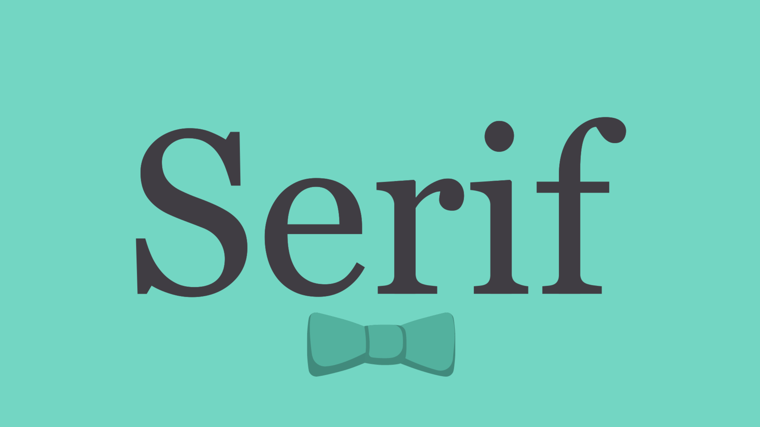
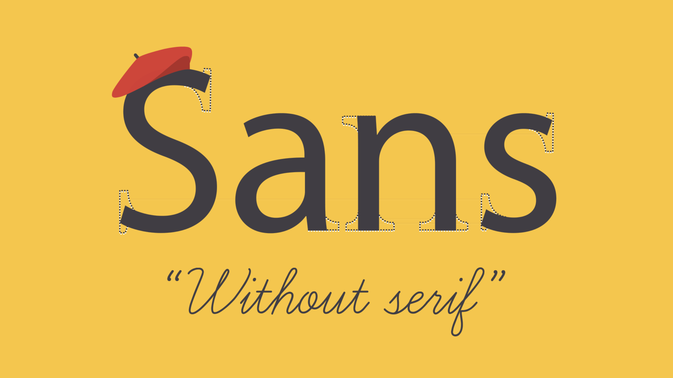
Type Classification
Serif, Sans-Serif, Slab Serif, Text, Script, Decorative
 |
| Image Reference: GCF Learn Free. What is Typography? Retrieved from: https://www.gcflearnfree.org/beginning-graphic-design/typography/1/ |
 |
| Image Reference: GCF Learn Free. What is Typography? Retrieved from: https://www.gcflearnfree.org/beginning-graphic-design/typography/1/ |
Important Elements of Typography
Consistency: Formatting, kerning, leading etc. all play a
role in making typography look consistent and professional.
Hierachy: Colour, size and visual weight/characteristics
(bold, italic) of the type aid the reader in reading certain text first. This
is important as text should be read by the viewer in the order it is intended.
Alignment: Flush left/right, columns, grid layout and
margins all play a part in making the design unified and helps to guide the
reader’s eye.
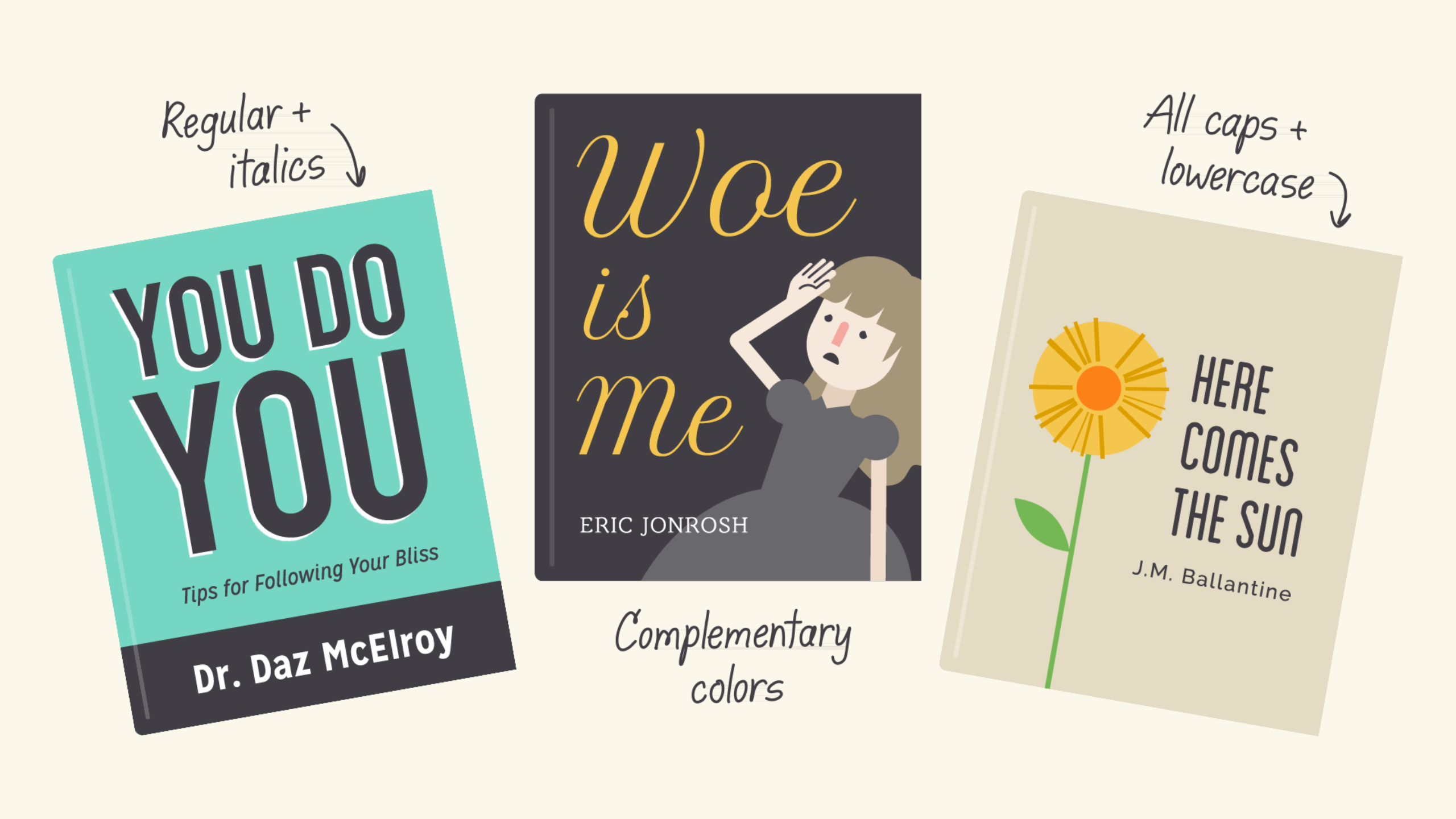
Good typography and layout reinforces the meaning of the text. This means that it supports the message, and makes the text more effective. Even though descriptive and script type classifications are my favourite (take a look at Katie Lombardo's hand-lettering below!) it might not suit the goals of the text best.
Consider this: which would make a better highway sign?
The script font for the second sign would be deemed 'prettier' and more aesthetically pleasing. However, we have to remember that signages serve a special purpose: it is meant to be read from a distance, at different lighting conditions, and from different angles. The first signage remains under all these situations, and constitutes good typography and layout because it supports the sign's message.
The same principle and logic applies for the signs below too. Even though the script font looks good and wouldn't be too out of place on a wedding invitation or the like, in this case I would think of it as bad typography since it isn't well suited to the task.
Thus I think that typography doesn't always have to be look good. Sometimes, its good to be ugly, (for the lack of a better word), because typography is primarily utilitarian.
I've also come across this website which I think, with its easy-to-read text and lovely graphics, gave a very concise summary of effective typography and formatting:
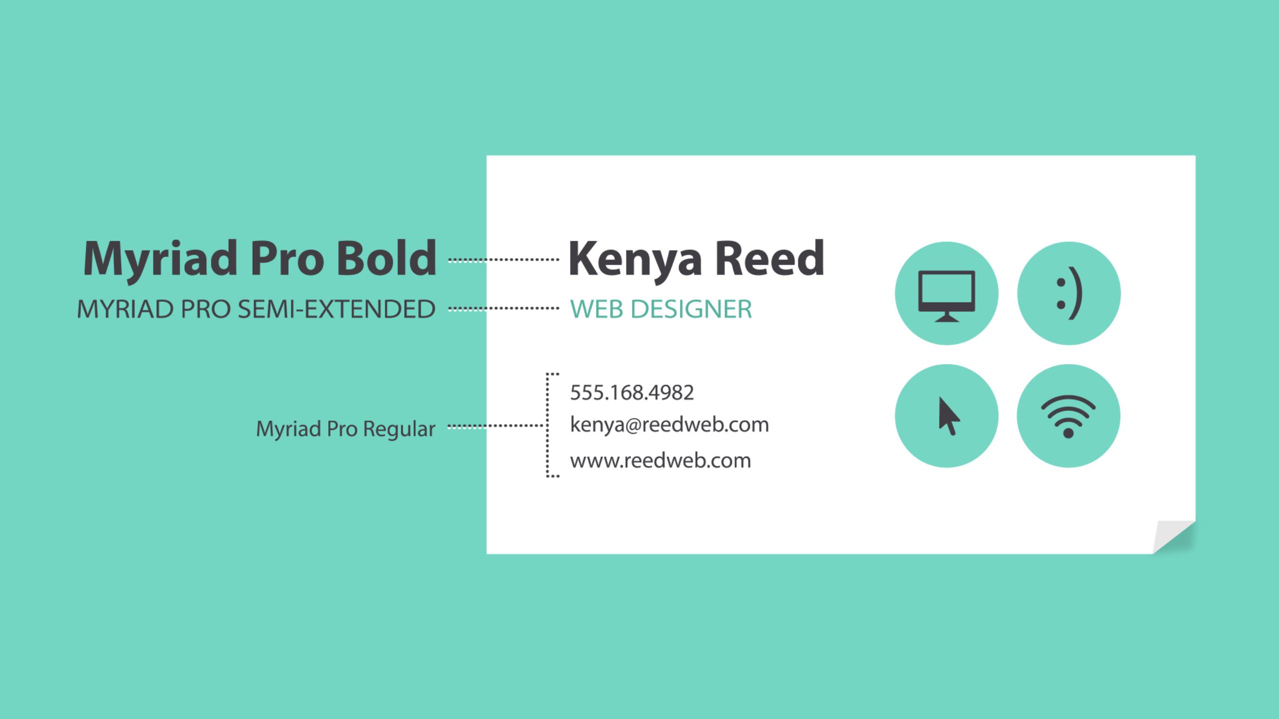
They repeated the great advice already given in the lecture on hierarchy, how we should make the elements we want readers to notice first stand out by making higher-level items bold. They also remind us to keep it simple and stick to a few complementary styles, especially for items like namecards where first impression really counts.
However, they also gave us valuable advice on experimentation and combining fonts. As always, opposites attract, so the bottomline is to combine fonts are different and complementary, and look to other designs for inspiration if we do not know where or how to start.
The website also give a tongue-in-cheek joke about what fonts to avoid:
In a way, fonts have their own language. They all have something to say beyond the words on the page. They can come across as casual or neutral, exotic or graphic. That’s why it’s important to think about the message, and choose a font that fits. Especially in this day and age where we are swamped with so much information and faced with so little time everyday, grabbing the attention of the audience, and maintaining this attention goes a long way to conveying your message most comprehensively. It is no longer to just be able to write, but also be able to present your information in a way that the audience can digest it quickly and clearly – and that really matters.
P.S I've also included some snippets from Typography Sketchbooks by Steven Heller and Lita Talarico below. You can grab a copy from Library@Orchard, which has a really good repository of typography books!
 |
| Image Reference: Type Theory. (2012). Typography Sketchbooks. Retrieved from: http://www.typetheory.com/?p=3238 |
Consider this: which would make a better highway sign?
 |
| Image Reference: What is Good Typography? Retrieved from: https://practicaltypography.com/what-is-good-typography.html |
 |
| Image Reference: What is Good Typography? Retrieved from: https://practicaltypography.com/what-is-good-typography.html |
The script font for the second sign would be deemed 'prettier' and more aesthetically pleasing. However, we have to remember that signages serve a special purpose: it is meant to be read from a distance, at different lighting conditions, and from different angles. The first signage remains under all these situations, and constitutes good typography and layout because it supports the sign's message.
The same principle and logic applies for the signs below too. Even though the script font looks good and wouldn't be too out of place on a wedding invitation or the like, in this case I would think of it as bad typography since it isn't well suited to the task.
 |
| Image Reference: What is Good Typography? Retrieved from: https://practicaltypography.com/what-is-good-typography.html |
Thus I think that typography doesn't always have to be look good. Sometimes, its good to be ugly, (for the lack of a better word), because typography is primarily utilitarian.
I've also come across this website which I think, with its easy-to-read text and lovely graphics, gave a very concise summary of effective typography and formatting:
They repeated the great advice already given in the lecture on hierarchy, how we should make the elements we want readers to notice first stand out by making higher-level items bold. They also remind us to keep it simple and stick to a few complementary styles, especially for items like namecards where first impression really counts.
 |
| Image Reference: GCF Learn Free. What is Typography? Retrieved from: https://www.gcflearnfree.org/beginning-graphic-design/typography/1/ |
However, they also gave us valuable advice on experimentation and combining fonts. As always, opposites attract, so the bottomline is to combine fonts are different and complementary, and look to other designs for inspiration if we do not know where or how to start.
 |
| Image Reference: GCF Learn Free. What is Typography? Retrieved from: https://www.gcflearnfree.org/beginning-graphic-design/typography/1/ |
The website also give a tongue-in-cheek joke about what fonts to avoid:
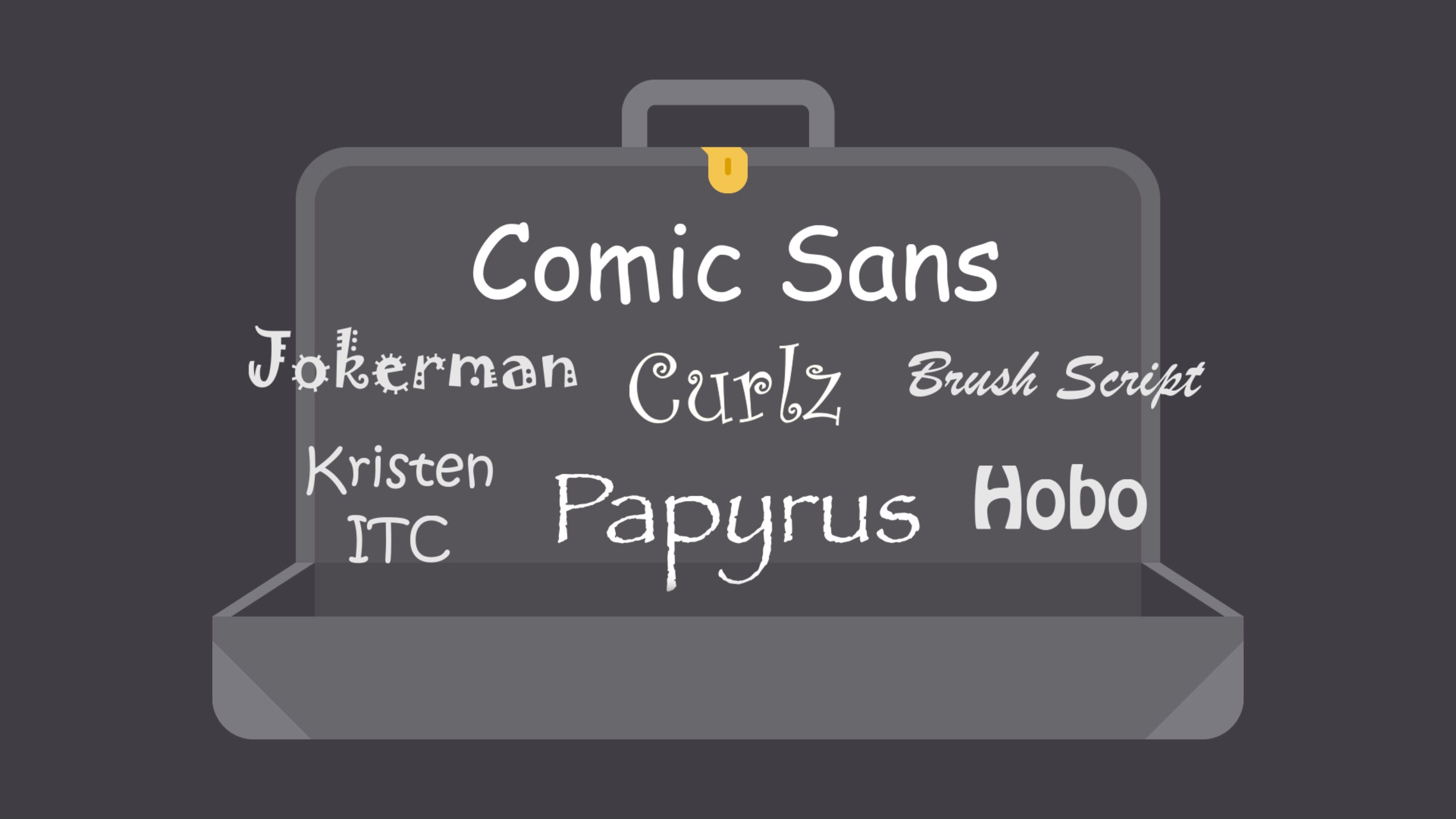 |
| Image Reference: GCF Learn Free. What is Typography? Retrieved from: https://www.gcflearnfree.org/beginning-graphic-design/typography/1/ |
In a way, fonts have their own language. They all have something to say beyond the words on the page. They can come across as casual or neutral, exotic or graphic. That’s why it’s important to think about the message, and choose a font that fits. Especially in this day and age where we are swamped with so much information and faced with so little time everyday, grabbing the attention of the audience, and maintaining this attention goes a long way to conveying your message most comprehensively. It is no longer to just be able to write, but also be able to present your information in a way that the audience can digest it quickly and clearly – and that really matters.
P.S I've also included some snippets from Typography Sketchbooks by Steven Heller and Lita Talarico below. You can grab a copy from Library@Orchard, which has a really good repository of typography books!
 |
| Image Reference: Type Theory. (2012). Typography Sketchbooks. Retrieved from: http://www.typetheory.com/?p=3238 |
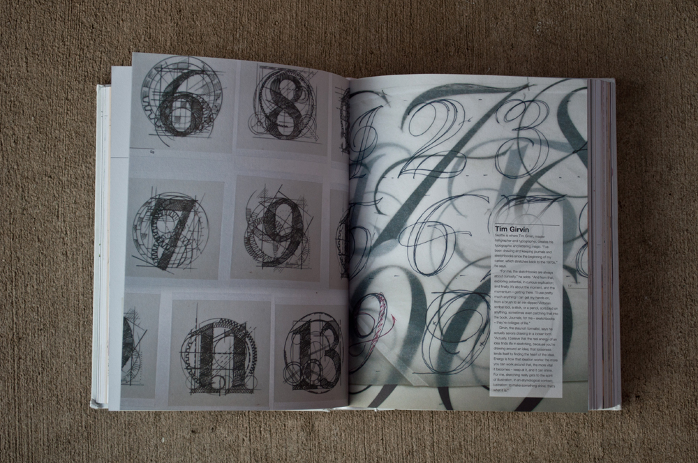 |
| Image Reference: Type Theory. (2012). Typography Sketchbooks. Retrieved from: http://www.typetheory.com/?p=3238 |
Comments
Post a Comment