 |
| Image Reference: Pinterest. (2017). Retrieved from: https://i.pinimg.com/736x/6a/ec/c8/6aecc8b092db181b7b12b75ddf76128d--id-magazine-magazine-covers.jpg |
After researching on several magazines, I decided on i-D magazine as the choice platform for my advertising sequence project 1B. As mentioned in the previous blog post for brand research, I think advertising on a magazine for Modcloth wouldn’t be out of line with their offline expansion plans.
I had certain criteria for the choice of the magazine,
namely:
- The target audience must fit well with the target market for Modcloth
- I wanted the magazine to have a presence outside of United States, as I thought it’ll be interesting for Modcloth to extend its reach outside of its typical American audience
- Magazine imagery should also be preferably consistent with that of Modcloth’s
- I also preferred a non-mainstream magazine. I didn’t care much for whether it’s a lifestyle or fashion magazine, because I think advertising on either had its own merits, but I wanted to be able to exercise creativity in terms of the direction of the advertising sequence without being stifled by the style, tone and mainstream appeal of the magazine
After narrowing down to a few choices, I finally selected
i-D magazine. The other magazine I had in mind was Dazed and Confused, also a
magazine aimed at British youths and young adults, but we will come to see why
i-D magazine was the eventual choice.
Brand/Product History
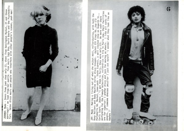
i-D magazine is a British magazine that caters to fashion,
art, music and street culture, founded by previous Vogue director Terry Jones in
1980 (Walpita, 2013). It pioneered The Straight Up, a hybrid form of fashion and
documentary-style photography where the subject (usually someone picked from
the street with great street or fashion style, and this meant typically punks
and new wave youths found on English streets back in the 80s) is pictured in a
head-to-toe portrait, accompanied by a short write-up of their lives, likes and
dislikes. This form of documentary photography is often used by many fashion
magazines nowadays, and also by the viral photoblog and book series Humans of New York. Over the years, i-D
magazine has evolved to a magazine glossy whilst retaining its rebel attitude
and street punk style. I will look into incorporating this in my advertising
sequence 1B if possible.


 |
| Images Reference: Walpita, S. (2013). Flashback: i-D Magazine's First Issue. Retrieved from: https://www.wgsn.com/blogs/flashback-i-d-magazines-first-issue/# |
i-D magazine is well-known for embracing both popular icons
as well as fresh talents. People who have been featured include supermodel
Chloe Sevigny, pop culture stalwarts Madonna and Kanye West, late designer
Alexander Mcqueen as well as a smattering of more unknown/up-and-coming models
and stars.
Target Audience
The target audience for i-D magazine has been identified as young
adults aged 15-28, especially females, although not explicitly stated but
this is what I have observed since the historical cover styles best represent
them. This is in line with the target audience for Modcloth. The price point of
the magazine is 3.30 pounds (Oliver, 2012) or around SGD$5.90 according to prevailing exchnage rates. This is slightly on the pricier side, which implies that it is probably aimed at a higher social class, as people who can afford the magazine would more likely be able to afford the associated lifestyle. Also, the readers of i-D magazine were found to be more subversive, creative, and inclined to the arts and fashion. Target audience wise, I think it is perfect for Modcloth to reach out to a large number of their intended audience effectively.
Magazine
Identity/Ethics
The name of the magazine, i-D, is an abbreviation of the
word identity and indemnity (Oliver, 2012) and relates to Freud’s concept of identity and
inner self. It refers to young people trying to find their self and identity
during this time, and I think it ties in very well with Modcloth’s message of
trying to help women find and be the best side of themselves.
Tipped on the side, the words i-D forms a winking smiley,
revealing the playful, fun and no-rules image of the magazine. Again, it
reminds audiences of the text emoticons/abbreviations that young people often
use while texting, again paying homage to its youthful yet sophisticated target
audience.
Branding Imagery
 |
| In the past, i-D magazine's cover page and layout used to be more colourful and cluttered. Now, content has been streamlined, and even the cover page does not contain any teasers or wordings unlike other magazines other than its namesake logo/name. Image Reference: Pinterest. (2015). Retrieved from: https://i.pinimg.com/236x/0c/2e/72/0c2e721aad45754576010573fdd88fab--s-fashion-magazine-fashion-magazines.jpg |
In the past, magazine layout and content used to be bright, wild and messy in accordance to the punk street style that i-D magazine embodies. However, it has become more minimalistic and toned down in recent years. A bright advertising sequence would hence, I believe, be more likely to stand out in i-D magazine according to this logic of similarity and contrast.
 |
| Image Reference: Pinterest. (2017). Retrieved from: https://i.pinimg.com/originals/06/37/f7/0637f748ba3a749c4f054ef3c693ceb3.jpg |
The magazine is well known for its distinctive and
revolutionary typography and photography (as mentioned earlier). There is
frequent use of a sans serif font type face, and is positioned in such a way
that it doesn’t distract but rather complements the bold and artful images. It
is also interesting to note that they use different layouts for each feature.
 |
| Image Reference: Fashion Gone Rogue. (2012). FKA Twigs on I-D Pre-Fall 2012 Cover. Retrieved from: https://www.fashiongonerogue.com/wp-content/uploads/2014/10/fka-twigs-id-pre-fall-2012-cover.jpg |

However, the key factor that made me choose i-D magazine
over Dazed and Confused was due to its cultural competency. While Black models
in Dazed and Confused were typically typecast as being steeped in hip hop
influences and wearing weaves or braids in their hair only (Slideshare, 2014), i-D magazine tended
to portray their models in a wide variety of styles without sticking to a
typical stock character or image. This, I found appealed more to a multicultural
audience and would resonate well with Modcloth’s reputation for inclusivity and
diversity.
Reputation-wise, i-D magazine is known for its constant
reinvention and creativity, and lives by the premise of originate and don’t
imitate. It is often a source of inspiration for many key opinion leaders and
trendsetters in the fashion industry, such as designers, models, photographers
and actors. Given that Modcloth’s apparel do not follow fashion trends as
closely as how other fast fashion labels like H&M or Topshop do, but is
more focused on carving its own niche in expressive, fun and vintage-style
fashion, I think it would appeal well to i-D magazine’s brand of non-mainstream
readers.
Previous
Advertorials/Campaigns/Inspiration
i-D magazine has featured many fashion and makeup brands,
just to name a few that has caught my eye:
Celine Spring/Summer 2015
 |
| Image Reference: Condinha, A. (2015). Celine Unveils its Latest Poster Girl: Joan Didion. Retrieved from: https://www.vogue.com/article/joan-didion-celine-ad-campaign |
Celine features 80 year-old novelist and dame of
cutting-edge style Joan Didion (Weinstock, 2015) for their 2015 Spring/Summer campaign in an
industry that otherwise worships the young. Classy.
Givenchy Spring/Summer 2015 (Weinstock, 2015)
 |
| Image Reference: Weinstock, T. (2015). Our favourite spring/summer 15 campaigns. Retrieved from: https://i-d.vice.com/en_uk/article/43vxq3/our-favourite-springsummer-15-campaigns |
Starring famous actress Julia Roberts, this advertising
campaign showcases the Pretty Woman star bare-faced and androgynously-dressed in
a tribute to timeless and understated elegance.
Celine Spring/Summer 2016 (Kinsella, 2016)


In a cheerful yet pleasantly sleek series of pictorials,
Celine goes back to the good old cut-and-paste, collage-themed design that
playfully pokes fun at the overtouching of advertisements in the media and
fashion nowadays.
Platforms
Besides the traditionary hardcopy bound magazine, i-D
magazine reaches out to young audiences all over the world through its online
site and with the help of social media platforms such as Facebook, Pinterest,
Tumblr and Youtube.
References
Kinsella, F. (2016). More of the best spring/summer 16 campaigns. i-D Magazine. Retrieved from: https://i-d.vice.com/en_uk/article/nenapx/more-of-the-best-springsummer-16-campaigns
Oliver. (2012). ID Magazine Front Cover Review. Retrieved from: http://oliver6038.blogspot.sg/2012/02/i-d-magazine-front-cover-review.html
Slideshare. (2014). Dazed & Confused + i-D Magazine Analysis. Retrieved from: https://www.slideshare.net/cloestead/dazed-confused-id-magazine-analysis
Walpita, S. (2013). Flashback: i-D Magazine's First Issue. WGSN Insider. Retrieved from: https://www.wgsn.com/blogs/flashback-i-d-magazines-first-issue/#
Weishstock, T. (2015). Our favourite spring/summer 15 campaigns. i-D Magazine. Retrieved from: https://i-d.vice.com/en_uk/article/43vxq3/our-favourite-springsummer-15-campaigns
Comments
Post a Comment