After learning about Semiotics and Abstraction in this week’s
lecture, we put the skills and knowledge we have gained into practice in the
tutorial workshop. Initially, I had done up a collage in tutorial but I wasn’t
satisfied with it. I had a lot of fun doing the initial collage, but I realised in the midst of the activity that I
1. Did not take any progress shots, which wasn't that major of an issue compared to 2
2. Was not meaningfully participating and reflecting over the techniques I had applied. I did not examine the effect that applying scale, deconstruction and repetition had on the images in isolation or as a whole. I was too absorbed in making the final image look good and that the elements look harmonious that I can't believe I overlook such an important part of the process. Bad Si Jia!!
Still in the spirit of mistakeism, I will be attaching an image of the failed experiment here:

Thus, I decided to explore more in terms of scale, repetition, and deconstruction in my own free time.
Scale:
This is the image I have used for the scale exercise:
 |
| I can't recall the source of the image, I feel regrettable about that too ): |
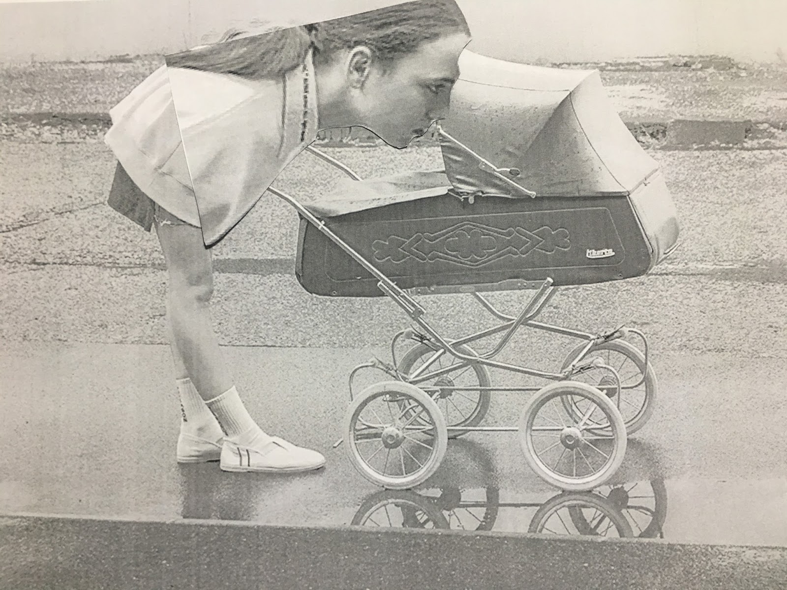
By scaling up just the head of the woman, she seems almost
menacing, instead of nurturing and protective towards the baby in the crib. It
is amazing just now scaling up specific portions of the photo can completely
change the meaning and underlying relationships/power differentials between
elements in the photo. I think it is especially so since the woman did not have a very friendly look on in the first place, thus by scaling up and putting her expression under a microscopic view for the viewer, her glare seems to be one of scrutinizing the baby (or whatever is in the crib) in hate.

Next, I tried to scale up the baby crib instead. It created a rather humorous effect, with the baby crib now completely overpowering the girl, which overturns rational thinking in terms of hierachy. It looks as if it is ready to swallow her whole! In this newly established asymmetrical power differential, the girl looks almost as if she had drank the “Drink Me” potion as Alice had in Alice in Wonderland. Even though I chose to scale up (and with the effect scaling down other elements in the photo) different parts of the image they both had very different intended outcomes.
Repetition:
In this exercise, I made use of Scale too in conjunction
with Repetition.
 |
| Image Reference: Mueller, F. W. (2017) Singularity III. Retrieved from: https://www.behance.net/gallery/53196729/Singularity-III |
I was drawn to this image as it had reminded me of the
housing in Hong Kong. I loved the interconnectedness of housing and living
spaces so I decided to vary the buildings in size and replicate them. I
realised that by doing so, I had removed the emphasis the photographer had
originally intended, to highlight the single building in solitary. Instead, now
the emphasis has shifted to the collective of the buildings as a whole.

I also played around with the arrangement of buildings and
found this point of view more interested. It reminded me of the ant’s/worm’s
point of view as we had learned in Lecture 3. It gives off the illusion as if
the viewer is trapped/overwhelmed by the massiveness of the housing structures,
and is reminiscent of the point of view many of us have in the city. In the initial image, the lone building had looked lonely, or from another perspective, grand in all its solitary, but through repetition it looks commonplace and suffocating.

Deconstruction:
In this exercise, I made use of Repetition too in
conjunction with Deconstruction. This is the image I have selected:
 |
| Image Reference: Stylenanda. (2017). 3CE Maison Kitsune. Retrieved from: http://en.stylenanda.com/product/3ce-maison-kitsune-pouch-navy/223592/ |
By repeatedly abstracting the woman’s face till we are only
left with the eyes, and placing them in a progression opposite from the
direction the woman’s gaze is directed at, it creates dynamism and movement in
the reconstructed image.

However, I tried to place the deconstructed elements in the opposite direction instead, and realised I liked this version better, even though I can't articulate why. Is it because there is some sort of 'balance', with the elements moving in the opposite direction from her face/posture? Or does it have to do with 'movement'? Does the gaze of the eye or the direction of the face determines 'movement' and hence 'dynamism'?

I think I further experimentation and learning throughout the course of the module might help to answer some of my questions!
Comments
Post a Comment